Security UX UI Design
Back to work

MFA Configuration

Designing BEACON's first self-serve, multi-factor authentication enrollment experience.

Timeline

Jan. 2026 - Apr. 2026

Tools

Figma

Role

Sole UX Designer

MFA settings preview MFA enrollment preview

Project overview

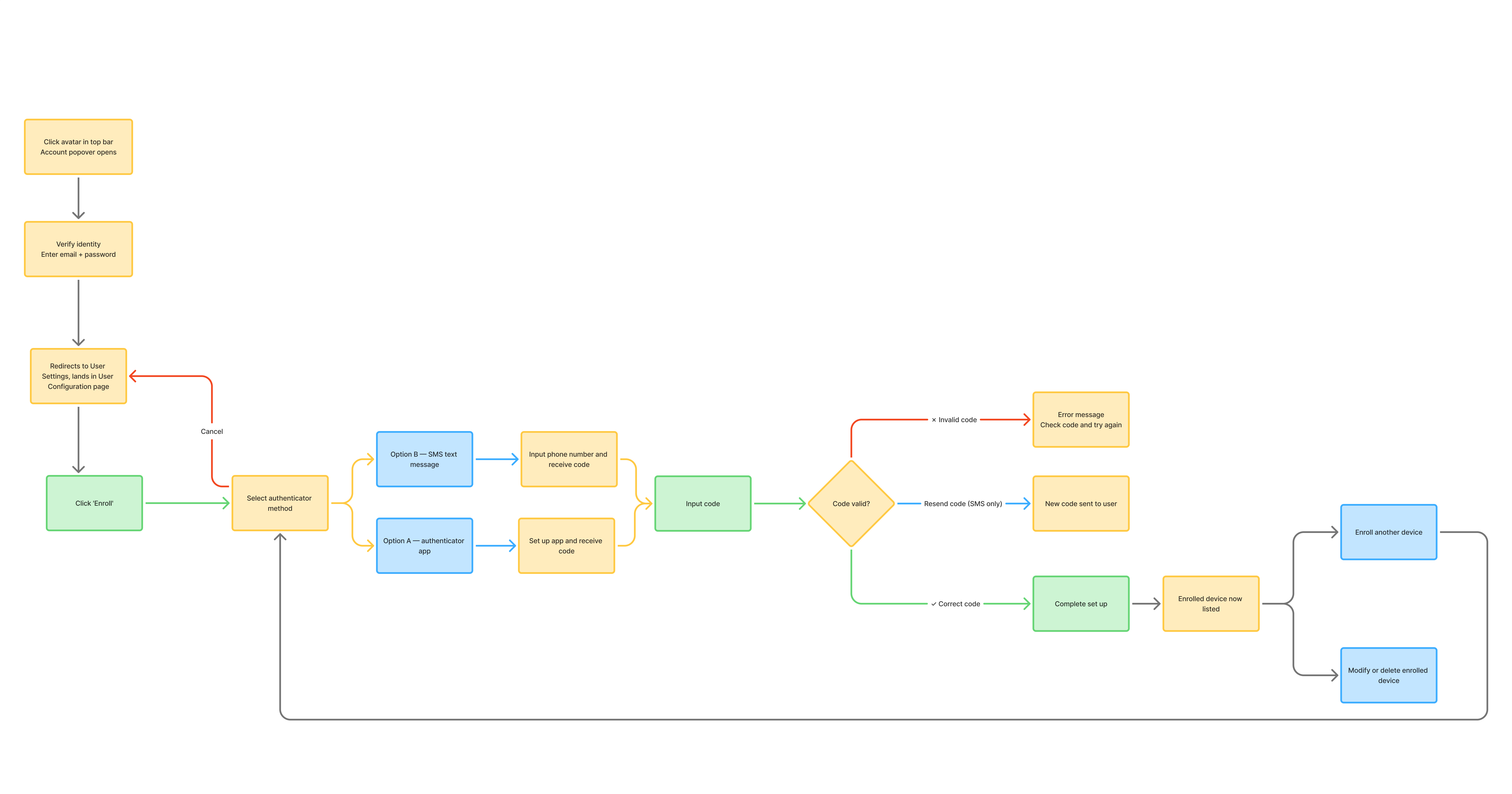
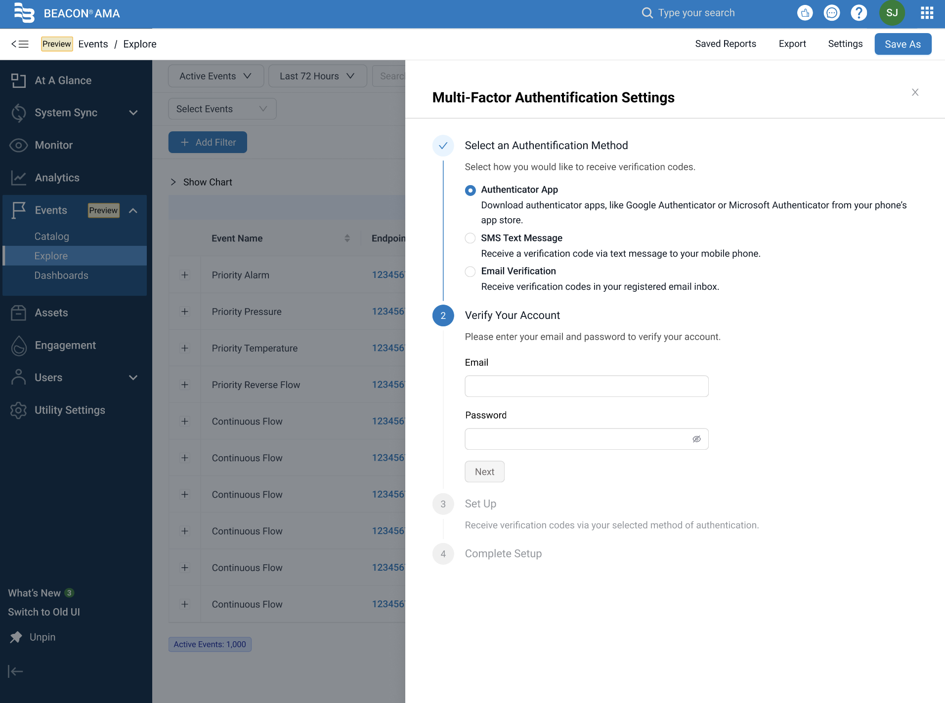
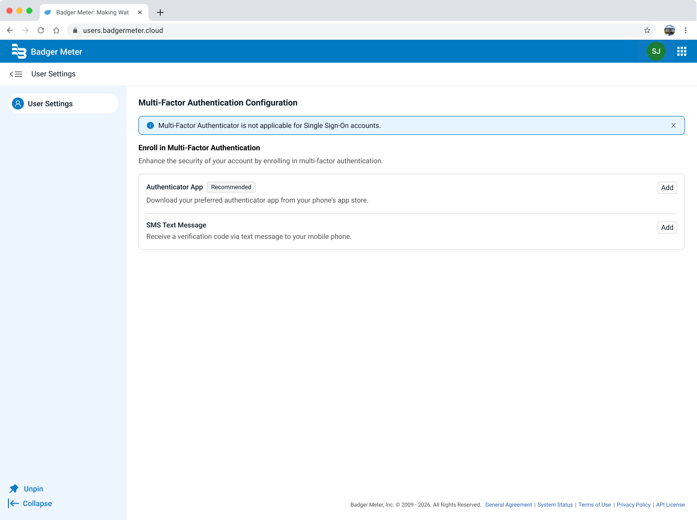
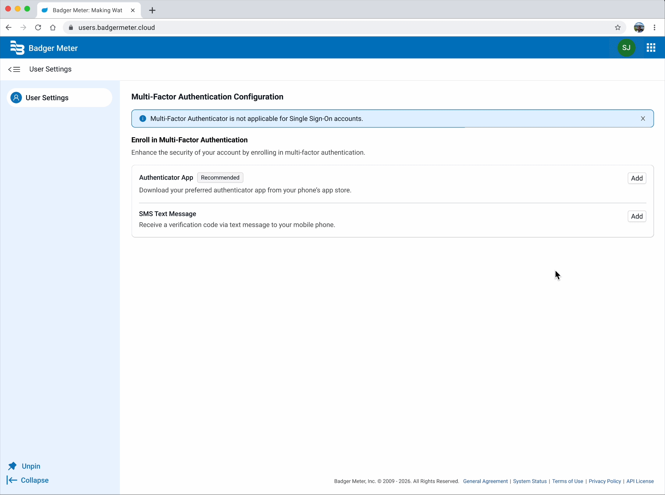
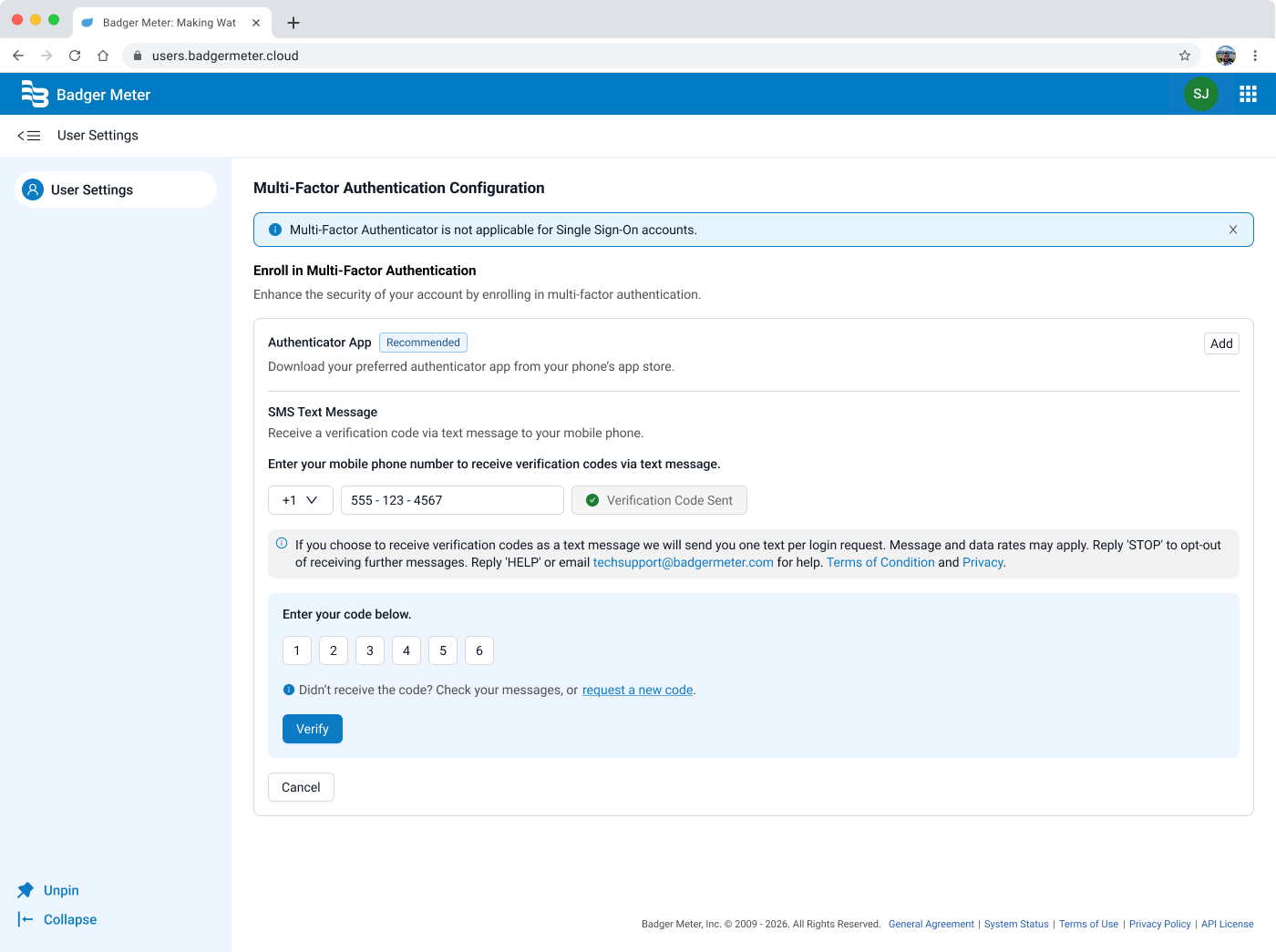
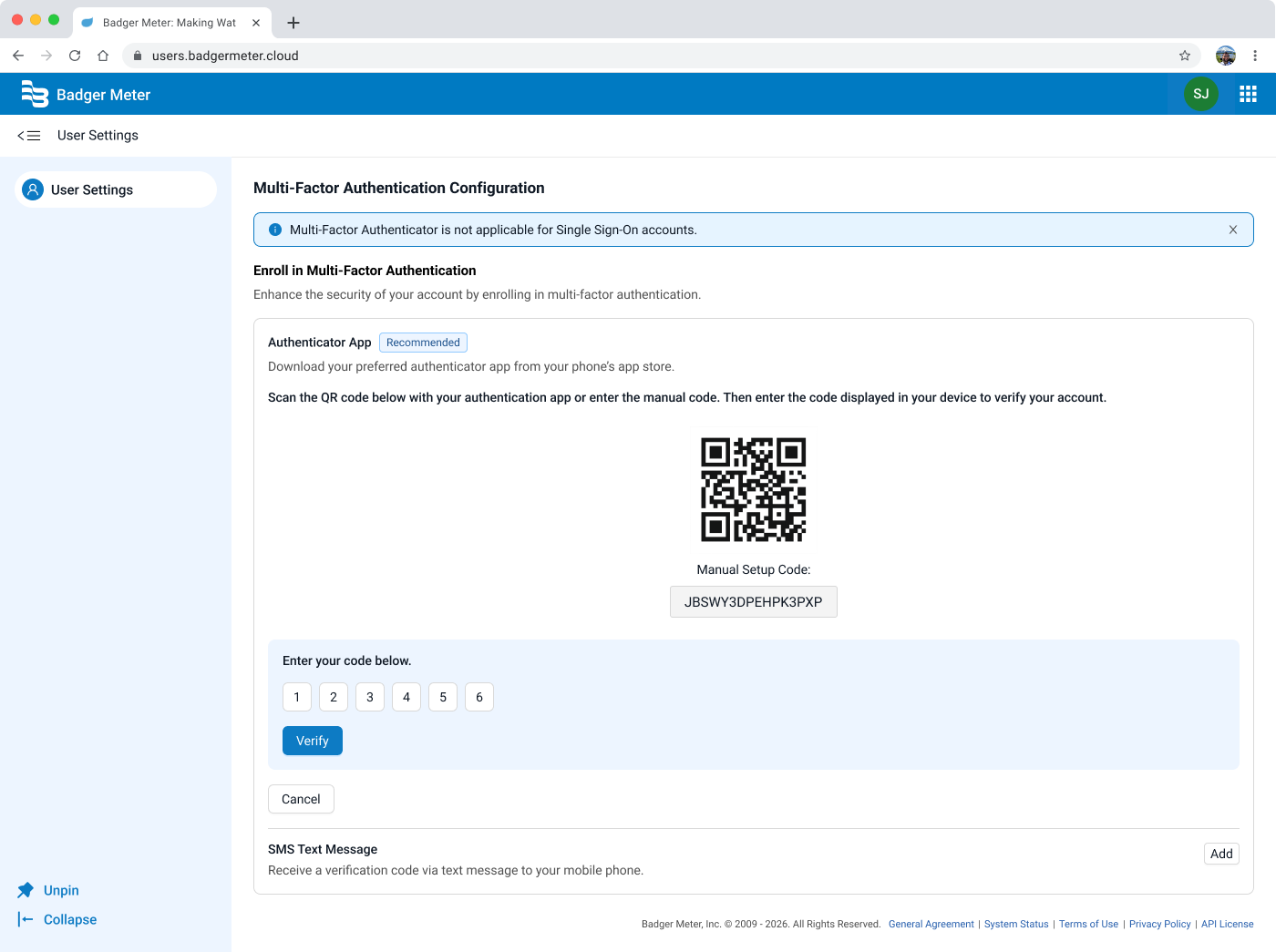
BEACON is Badger Meter's platform for utility and water management, used by utility staff members to monitor usage, manage accounts, and stay on top of data across their networks. This project introduced multi-factor authentication (MFA) enrollment to the BEACON platform for the first time.

As the sole UX designer working on this feature, I was responsible for designing a self-serve enrollment experience that felt familiar, clear, and trustworthy. From the moment a user decides to set up MFA, all the way through successful verification, I had to make sure to create a seamless experience. The outcome was a dedicated security settings page, housed in a new external User Settings tab, that became the foundation for future account management capabilities.

What needed to change?

Previously, the application had no MFA capability at all. Users could only secure their accounts with a password, leaving them vulnerable to credential-based attacks. The security of our users became a point that we needed to address, especially as the product matured and our user base grew. The absence of MFA became a significant vulnerability, as it undermined both user trust and our overall security posture.

  • User pain pointPassword-only authentication left accounts exposed to credential-based attacks. Users had no way to independently add a second layer of protection, creating real risk for accounts managing sensitive utility data.
  • Business needEnabling MFA was a product priority to meet growing security expectations, as the lack thereof creates real risk for accounts managing sensitive utility data. Building this feature led us to create a new User Settings area outside the main application, which would later store and house all future account-level settings.

Defining success

I framed the goals of this project around both the user experience and the broader product vision:

Self-serve enrollment

Users can set up and manage MFA entirely on their own, with no support intervention required.

Designing for clarity and trust

The flow should feel familiar, drawing on patterns users already know from apps like GitHub and Microsoft Authenticator.

Establish a scalable settings foundation

The new User Settings tab should be designed with the intention of supporting other account settings in the future.

Minimize drop-off during set up

The enrollment flow should be straightforward and forgiving in the case where a user makes a mistake.

Understanding our users

My research focused on two things: understanding what users already expected from MFA based on their experience with other tools, and identifying where standard MFA flows tend to cause frustration.

I conducted a competitive analysis of MFA enrollment experiences across two platforms, Microsoft Authenticator and GitHub. I chose Microsoft Authenticator as it's a popular authenticator app among consumers, and because it represented an example of a guided, step-by-step enrollment flow. GitHub, on the other hand, was an example that was brought in later by product marketing and engineering as a reference to have all the steps be surfaced at a glance, allowing for a more streamlined approach.

GitHub

At-a-glance view

  1. 1

    Navigate to Settings → Password and authentication

  2. 2

    Choose method: authenticator app or SMS/text message

  3. 3

    Scan QR code — setup key available as fallback if scan fails

  4. 4

    Enter 6-digit TOTP code to verify and save

  5. 5

    Status shown inline as “Configured” badge; Edit option available


Setup key fallback Multiple methods “Configured” status badge Edit option post-setup

Dense copy for first-timers SMS flagged “Less secure” — may confuse users

Microsoft

Step by step flow

  1. 1

    Go to account.microsoft.com → Security tab → Manage how I sign in

  2. 2

    Select “Add a new way to sign in” → Choose “Use an app”

  3. 3

    Prompted to download app if not already installed

  4. 4

    Open app, tap +, select Personal account → Scan QR code

  5. 5

    Manual code entry available if camera scan fails


App download prompt built in Manual code fallback Supports TOTP + push + passwordless Works for non-Microsoft accounts too

Requires switching between web & mobile mid-flow Multiple account types = branching paths Navigation is buried (3+ clicks to reach setup)

Key takeaways from research:

  • Design for mistakes, not just successThe most common failure point in MFA setup isn't confusion — it's small errors like QR codes not scanning. Providing a manual entry fallback is essential to keeping users moving.
  • Benefits of a single focused screenGitHub's at-a-glance layout, brought up by engineering and product, showed that users can benefit from seeing all the information at once rather than one at a time.
  • Always provide a fallbackIf QR scanning fails and there's no alternative, users drop off. An option to input a key manually is essential to fill in this gap.

Synthesizing insights

After reviewing requirements from the product team and synthesizing research findings, I mapped out the end-to-end user journey for MFA enrollment. This helped me organize all the necessary steps needed in order to create a successful user experience.

Initially, we had the users select their authentication method first, and then reverified their identity. After consulting with the engineering team, we realized that this wasn't the correct flow.

Thus, I moved the reverification step to the very beginning so the user isn't interrupted in the middle of the set up flow by being asked to confirm their identity. Once they reverify their identity in the very beginning, they will have full access to manage their MFA setup (and their devices) within that session window without any interruptions, providing a more seamless and improved user experience.

Original vs. restructured user flow

Click to view!

Problem statement

Our platform lacked any multi-factor authentication capability, making it impossible for users to protect their accounts independently — leaving them vulnerable and without the self-serve security options they expect from modern software.

Exploring possibilities

One of the earliest decisions was where to house the MFA settings. Initially, I designed it to be within the existing application UI through a drawer design.

Early explorations — drawer vs. dedicated settings page

Given that users unfamiliar with authenticator apps would need clearer guidance, I decided to break the flow up into steps, which reduced cognitive load and made error recovery easier.

Initially, we decided that we would support three methods of MFA: an authenticator app, SMS text message, and email verification. However, we decided to not support email verification for MVP.

From rough to refined

Through rounds of reviews with product and engineering, two things shifted the direction of the designs:

  1. 1
    Dedicated User Settings tab

    A product decision to create a dedicated external User Settings tab that would scale beyond MFA. We landed here because this would give us a great opportunity to expand on other user settings in the future, as it established a logical home for all future account-level settings.

  2. 2
    At-a-glance, single-screen flow

    To implement a similar MFA flow to that of GitHub's, shared by product marketing and engineering as a reference. This evidently challenged whether the step-by-step structure was adding clarity or just adding additional steps.

Wireframes — authentication method cards

Some changes included:

  • Structure The step-by-step flow (Select Method → Verify Account → Set Up → Complete) was replaced with a single view that gives the user the ability to jump into configuring MFA by an authenticator app or SMS.
  • Method hierarchyThe original treated all three methods (Authenticator App, SMS, Email) as equal radio button choices. The final design makes a clear recommendation, leading with the authenticator app. This leans users toward the more secure option without restricting them from using SMS.
  • LocationMoved from a modal/drawer context into the proper User Settings tab, giving it a permanent home.

A combination of all these changes provided the MFA flow with a more streamlined experience, while setting up a foundation for future settings to live.

The finished experience

The final design centered on a new page within a dedicated User Settings area, which would be accessible externally from the main product. The landing page leads directly with the two available methods: Authenticator App and SMS Text Message, each as a card with an "Add" button. There's no explicit "Enroll" step like in the original designs, which gives users the ability to see their options immediately and act on them in one click.

Final designs — Authenticator App flow

Authenticator App flow

Clicking "Add" on the Authenticator App card expands the setup inline, presenting the QR code and manual setup code together on the same page. Users who can't scan the QR code can copy the setup key directly into their authenticator app. Below, individual digit input fields guide users through entering their verification code before hitting "verify."

Final designs — SMS flow

SMS flow

Clicking "Add" on the SMS card also expands it inline on the same page, while keeping the Authenticator App card visible above, so the method hierarchy is never lost. Users enter their phone number, send a verification code, and enter it. A "Didn't receive the code?" prompt with a request link is surfaced directly below the input, anticipating the most common pain point for users before they have a chance to get stuck.

Once verified, users will encounter a success modal that explains that MFA is now active, with clear messaging about what changes for future logins. Two exit paths are offered: return to User Settings, or exit entirely. This closing moment was intentional, signifying completion clearly and orienting the user back to their broader context rather than leaving them on a setup screen with nowhere obvious to go.

So what changed?

This project delivered the first iteration of MFA enrollment for our platform, which was a capability that did not exist prior. While the product hasn't launched publicly yet, the design lays the groundwork for measurable impact on both user security and product scalability.

  • Qualitative ImpactBeyond the numbers, this project established something larger: a dedicated and scalable User Settings tab, where we can add future account related settings.
  • Quantitative ImpactMetrics are to be added — including MFA enrollment success rates post-launch.

What I learned

Although the project didn’t start off with the idea of creating a new dedicated User Settings tab, it definitely became something that I am excited to expand upon. Unknowingly, this project became a foundational decision that will quietly shape the product for a long time.

As I've continued working with our IAM (Identity Access Management) team on other projects, it further reinforces the potential the User Settings tab holds. The MFA page has set a foundation for a centralized hub where users can manage their identity, security, and account preferences in one place, rather than having to search through the entire application to find where they want to be.

The most natural next step would be expanding the MFA methods available, specifically adding email verification as a third option alongside the authenticator app and SMS. Email is a familiar, low-barrier method for users who may not have an authenticator app or a mobile number readily available, and it would make the enrollment experience more inclusive without complicating the existing flow.

Post MVP, I am currently working on the mobile screens for these designs as well for users to easily complete this experience from their mobile device.

← Previous project Back to all work

miffy says hi!

Miffy peeking