UX Design UX Research
Back to work

Water Budgets for EyeOnWater

Designing a self-serve water target experience for users to aid in their water conservation efforts.

Timeline

2025 - Present

Tools

Figma

Role

Sole UX Designer

Project Overview

EyeOnWater is the customer-facing application from Badger Meter, designed to give homeowners real-time visibility into their water usage and proactive leak alerts. Users are customers of water utilities — people who want to understand their consumption but haven't always had the tools to act on it. The app puts that data directly in their hands, making the invisible visible.

Water Budgets is a new feature within EyeOnWater that gives users the ability to set a personal water target — one per meter — and track their progress toward it over time. Rather than simply observing how much water they use, users can now define how much they want to use, turning passive data into an active conservation goal.

This was a net-new feature with no prior equivalent in the product. It originated as a utility-imposed model — where utilities would set water targets for their customers — but evolved into a user-driven one, giving homeowners full agency over their own conservation efforts. The project has been ongoing for over a year, progressing through multiple rounds of iteration across low, mid, and high fidelity.

What needed to change?

EyeOnWater already gave users visibility into their water usage — but visibility alone doesn't change behavior. Users could see how much water they were using, but had no way to define how much they wanted to use. Without a target to measure against, the data was informative but not actionable. For utilities facing periods of mandated conservation, this gap was especially pronounced: there was no mechanism in the product to support or encourage reduced consumption at the user level.

User Need

Homeowners who cared about conservation had no way to set a personal goal within the app. They could monitor their usage passively, but couldn't establish a target to work toward, track their progress, or feel a sense of ownership over their efforts. The experience was observational, not participatory.

Utility / Business Need

Utilities needed a way to support water conservation efforts through the product — particularly during times when reduced consumption was a priority. The original direction was utility-imposed targets, but the model shifted to user-driven goals to better respect user autonomy and encourage voluntary participation in conservation.

Defining success

Success for this feature meant more than shipping a form — it meant creating an experience that genuinely motivated users to engage with their water usage in a new way. I framed our goals around both the user experience and the broader conservation mission:

  • Enable self-serve goal setting — users can create, view, and manage a personal water target entirely on their own, without utility intervention.
  • Make progress visible and meaningful — the detail view should communicate how a user is tracking against their target in a way that feels motivating, not clinical.
  • Design for simplicity at the entry point — the creation form should be short, clear, and low-friction so users aren't discouraged before they even start.
  • Build a scalable foundation — the one-target-per-meter constraint was a deliberate scoping decision for v1, establishing a clean model that could expand in future iterations.

Finding direction

Because Water Budgets was a net-new feature with no prior equivalent in EyeOnWater, I started from scratch — with a moodboard. Rather than jumping straight into flows, I wanted to first establish the visual and emotional tone of the experience. Water conservation is a topic that can easily feel guilt-inducing or overly technical; the goal was to find a direction that felt encouraging, clear, and personal.

I also looked at how other apps handle goal-setting and resource tracking — fitness apps, budgeting tools, and energy monitors — to understand what patterns make progress feel tangible and motivating. The key insight across all of them: users respond best when they feel in control of their goal, can see their progress at a glance, and receive positive reinforcement for making headway.

Shaping the design challenge

After research, I developed a set of "How Might We" questions to reframe the problem space before moving into solutions. This step was especially important on a project with shifting scope — the HMW questions helped anchor the team on what we were actually trying to solve for the user, independent of how the feature was being defined at the product level.

Problem Statement

EyeOnWater users need a way to set and track a personal water conservation goal because they want to actively reduce their usage — not just observe it — but currently the app provides no mechanism to define a target or measure progress against it.

Exploring possibilities

The ideation phase began with a broad question: what does it actually mean to give a user a "water budget"? I explored different mental models — a quota to stay under, a goal to hit, a historical baseline to beat — and how each framing implied a different experience. The tone of the feature shifted significantly depending on which model was chosen.

A major inflection point in ideation was the pivot from the utility-imposed model to the user-driven one. In the original direction, utilities set the target and users were expected to comply — which created a very different design problem from the one we ultimately solved. Once the direction shifted to user-created targets, the experience opened up: users needed to understand what to set, how to set it, and what it meant for their usage going forward.

From sketch to screen

I started with low-fidelity sketches — hand-drawn explorations of the core flows: how a user discovers the feature, what the creation form feels like, and how progress is communicated on the detail view. At this stage I was focused on structure and sequence, not visual design. Sketching allowed me to quickly test multiple layouts without getting attached to any one direction.

Mid-fidelity brought the structure into Figma, where I could test layouts against the existing design system and gather feedback from product and engineering. This phase involved several significant pivots — most notably around scope. The feature had begun as a broad conservation dashboard concept, and through ongoing reviews it was refined down to two core surfaces: a creation form and a detail view. Keeping scope tight was the right call for v1, and mid-fidelity was where that clarity emerged.

High-fidelity designs applied the full EyeOnWater visual language to the refined scope. Key decisions at this stage included how to present the creation form in a way that felt guided without being overwhelming, how to visualize progress on the detail view in a way that was immediately readable, and how to handle edge cases — such as what happens when a user has already created a target for a given meter.

The finished experience

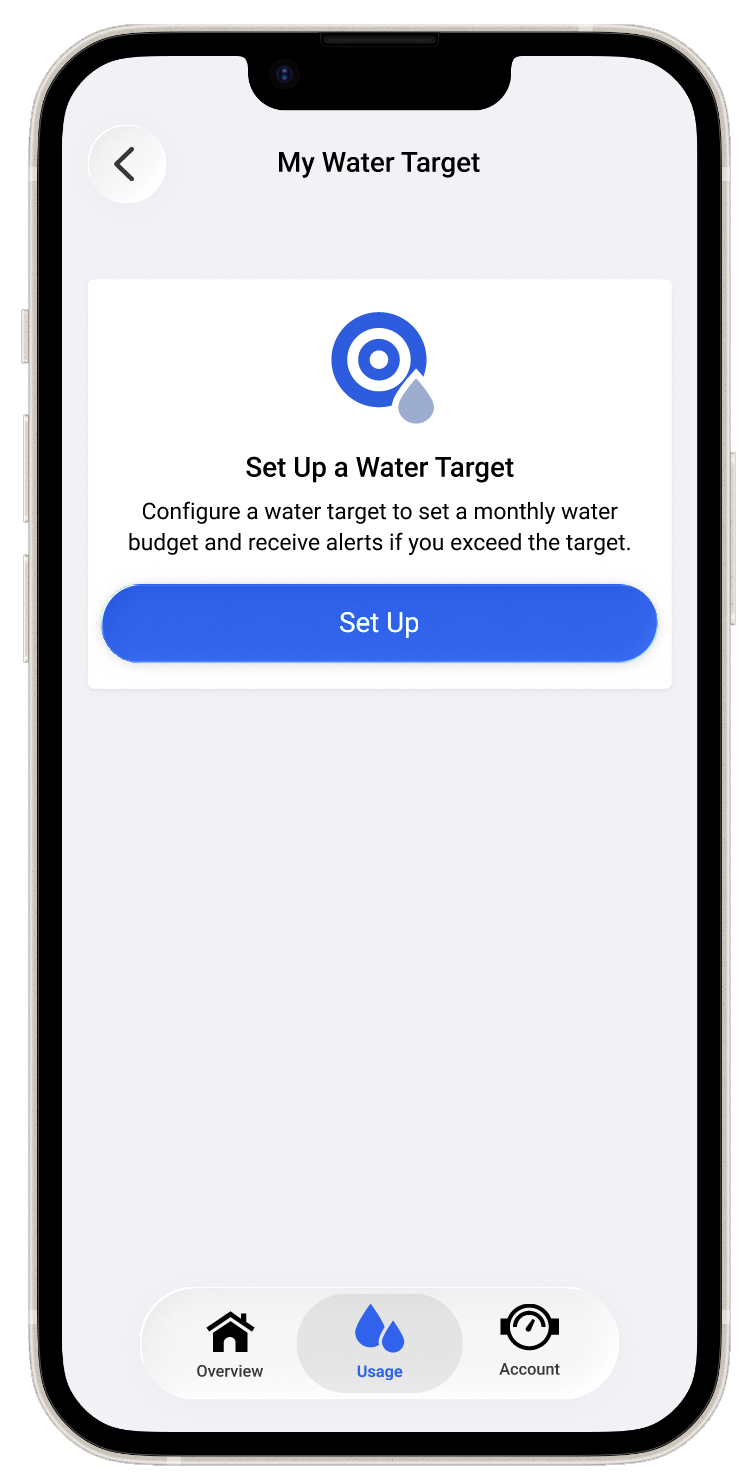
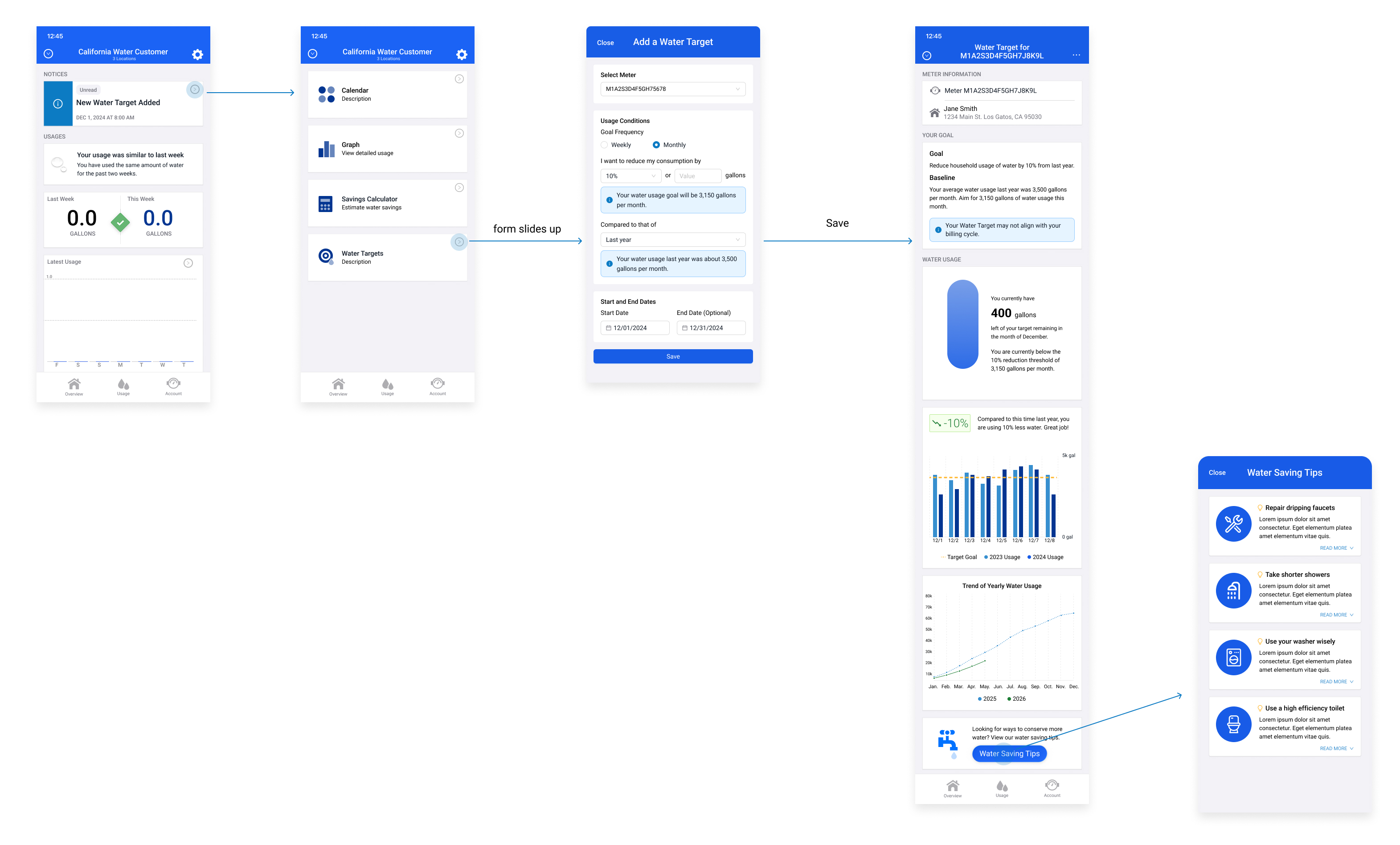
The final design centers on two core surfaces: the water target creation form, and the detail view page that becomes the user's home base for tracking their conservation progress.

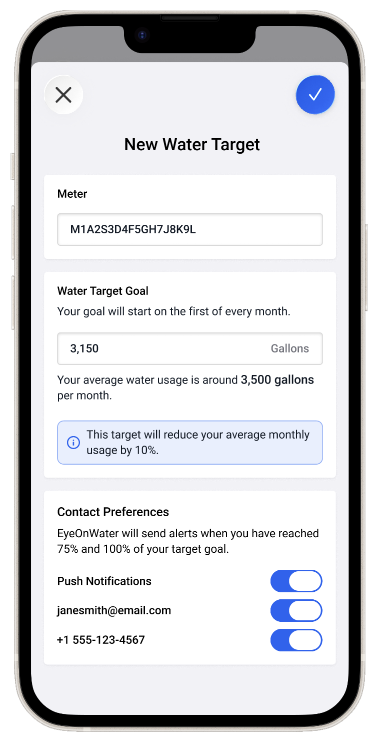
The creation form is intentionally simple — users select the meter they want to set a target for, define their usage goal, and confirm. The one-target-per-meter constraint is surfaced clearly in the UI, so users always understand the scope of what they're creating. The form is designed to feel low-stakes: easy to start, easy to complete, and easy to revisit.
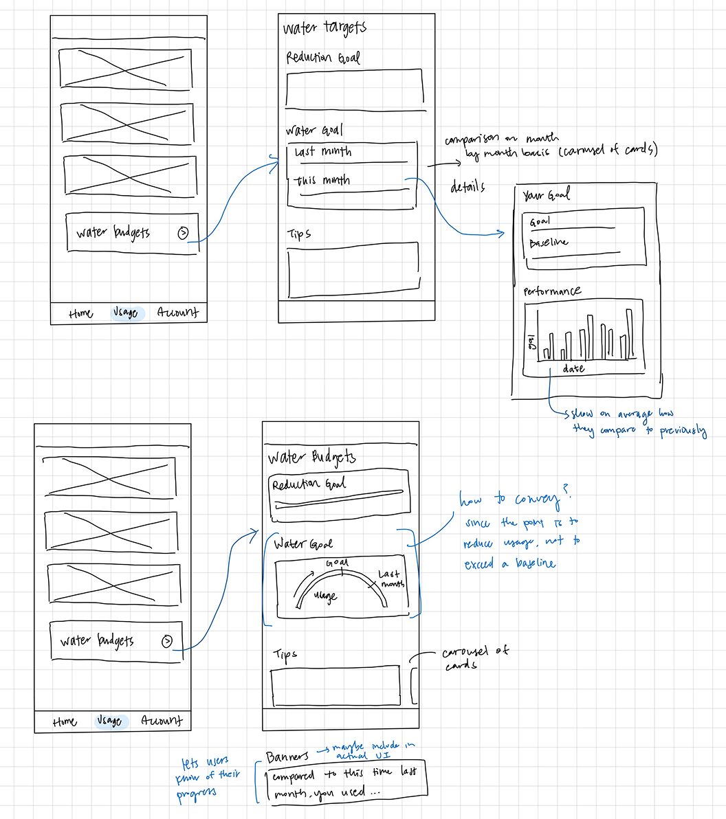
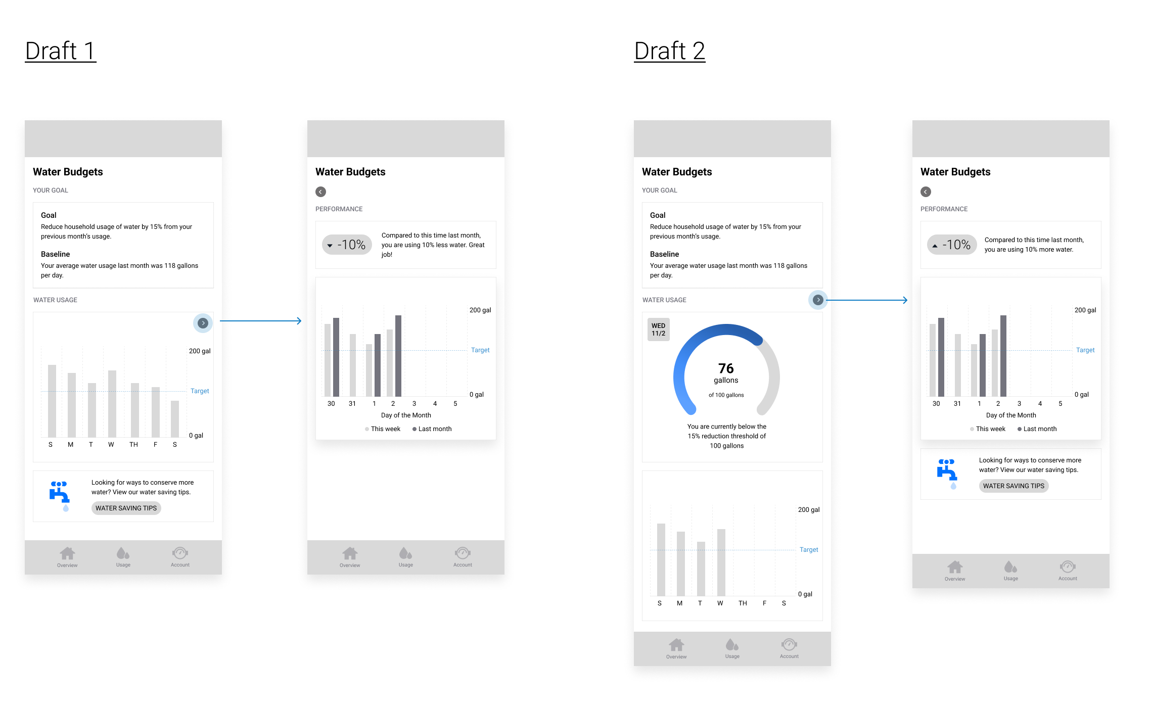
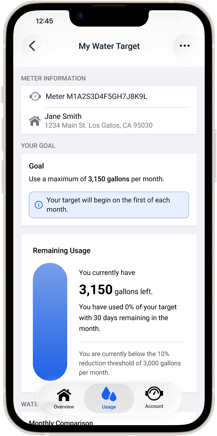
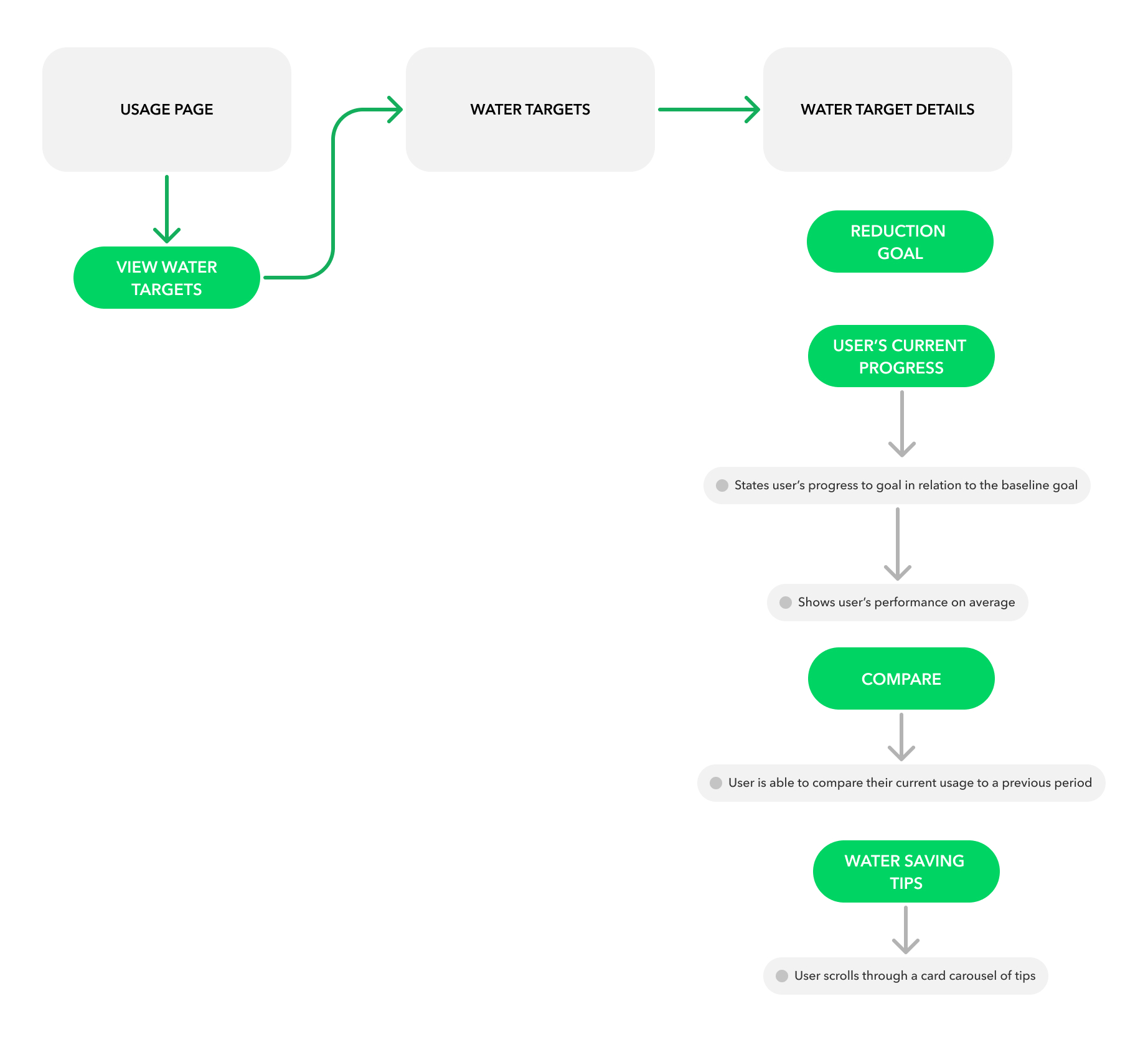
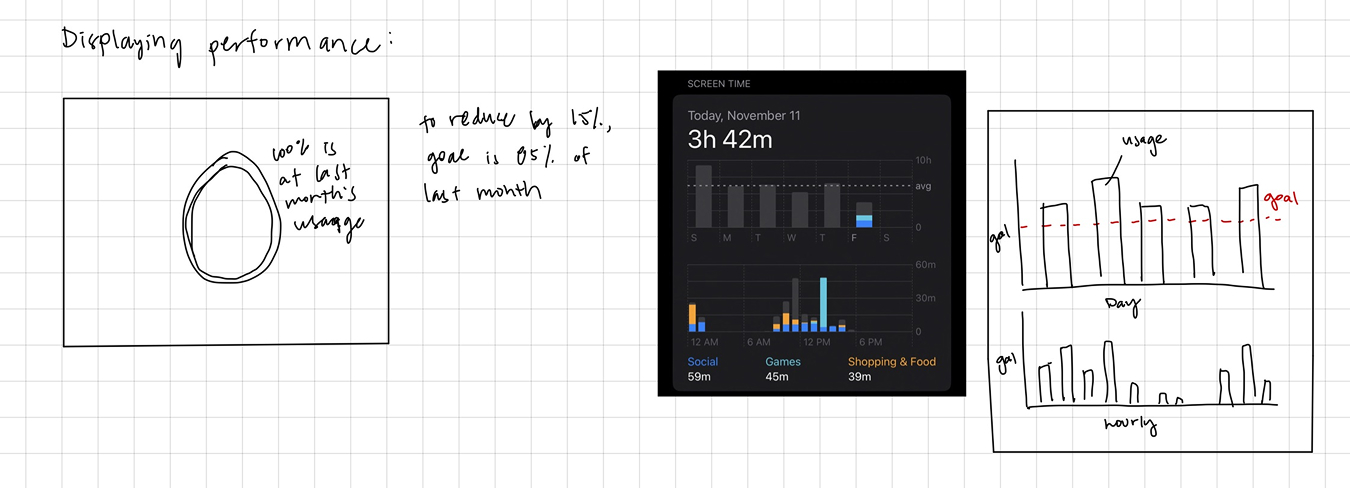
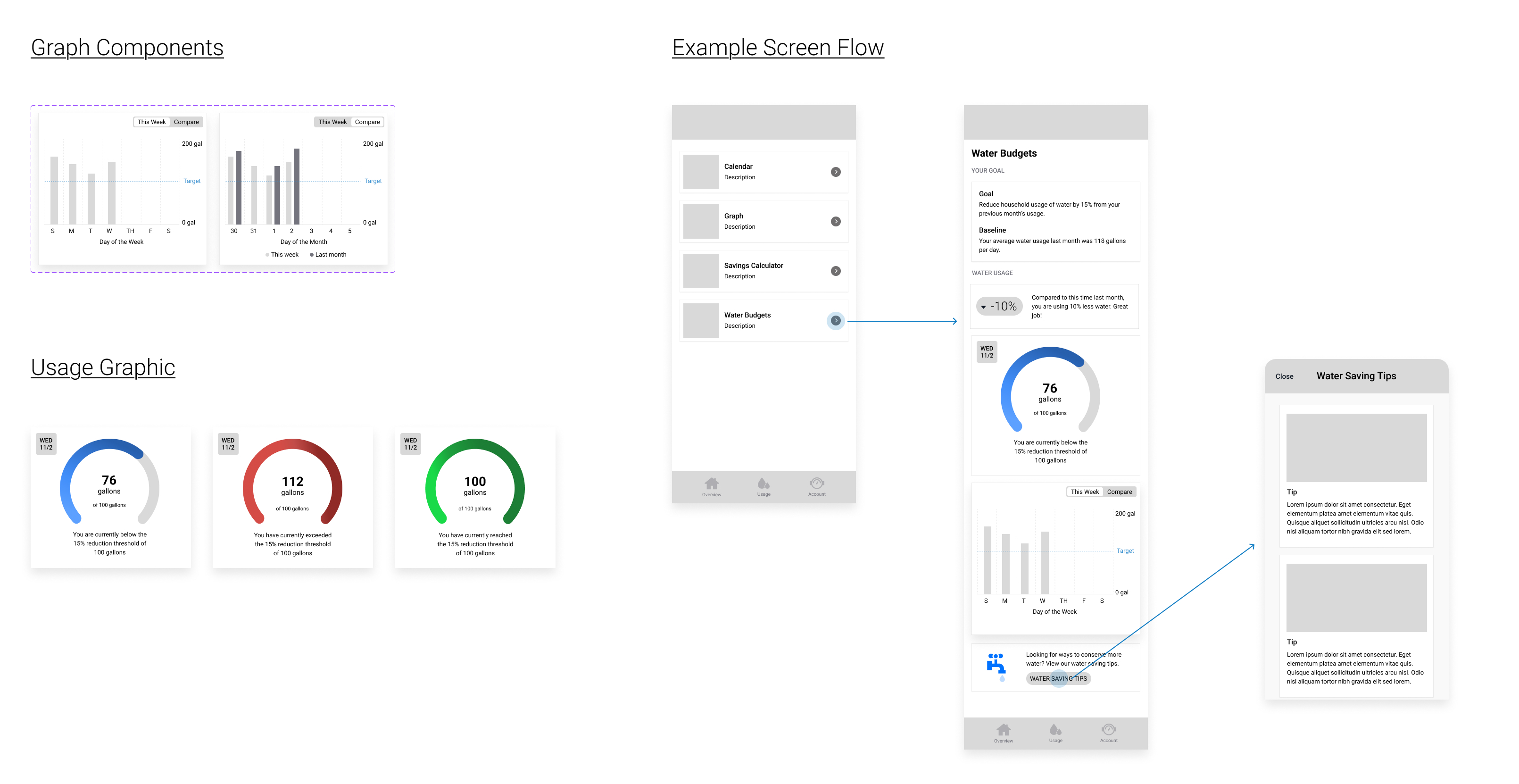
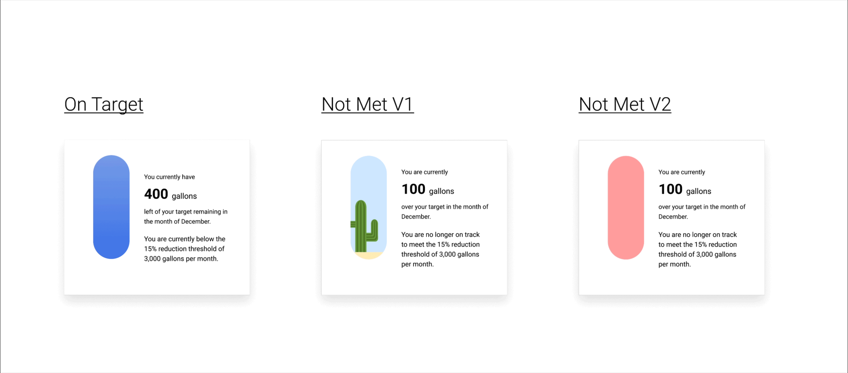
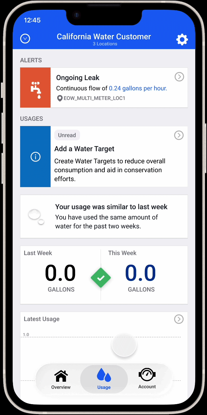
Once a target is created, the detail view gives users an at-a-glance read on how they're tracking — presenting their current usage against their goal in a way that feels motivating rather than punitive. Users can edit or remove their target from this view, keeping full control in their hands. The page is designed to be worth returning to: useful enough that users have a reason to check in on their progress throughout a billing cycle.

What changed?

Water Budgets is an ongoing project that continues to iterate. The feature has moved through a full design cycle — from moodboard and HMW questions through low, mid, and high fidelity — and the core experience of user-created water targets is taking shape. What's most significant so far is the strategic pivot itself: moving from a utility-imposed model to a user-driven one fundamentally changed what success looks like for this feature, and the design reflects that shift.

Quantitative Impact

Metrics to be added once the feature launches — including water target adoption rate among active EyeOnWater users, engagement with the detail view, and any measurable change in usage patterns among users who set a target vs. those who don't.

Qualitative Impact

The shift to a user-driven model has been well-received internally, aligning the feature more closely with EyeOnWater's broader mission of giving homeowners agency over their water usage. The project has also sharpened the team's thinking about what conservation-focused design looks like in practice — and what it doesn't.

What I learned

Designing Water Budgets over the course of a year taught me something that's hard to learn on shorter projects: how to stay anchored to the user problem when everything else around it is shifting. Scope changed. The product model changed. Priorities shifted. Through all of it, the HMW questions and the early research work kept the team grounded in what we were actually trying to solve — giving users a meaningful way to participate in conservation, not just observe it.

Starting from scratch — moodboard, HMW questions, sketches, all the way through to high fidelity — reinforced how much early-stage process work pays off later. The moodboard in particular was valuable not just for visual direction, but for aligning the team on tone before a single screen was designed. It's a step I'll bring to every new feature from here on.

Looking ahead, there's a lot of room for Water Budgets to grow. Future iterations could include proactive notifications when a user is approaching their target, historical tracking across billing cycles, and potentially exploring how email verification could serve as an additional touchpoint for conservation nudges. The foundation is in place — what comes next is making it smarter and more personal over time.

← Back to all work Next project →

miffy says hi!

Miffy peeking